What We’re Missing Out On When We Ignore Color in Design. Color Sets The Tone Before Users Read a Single Word.
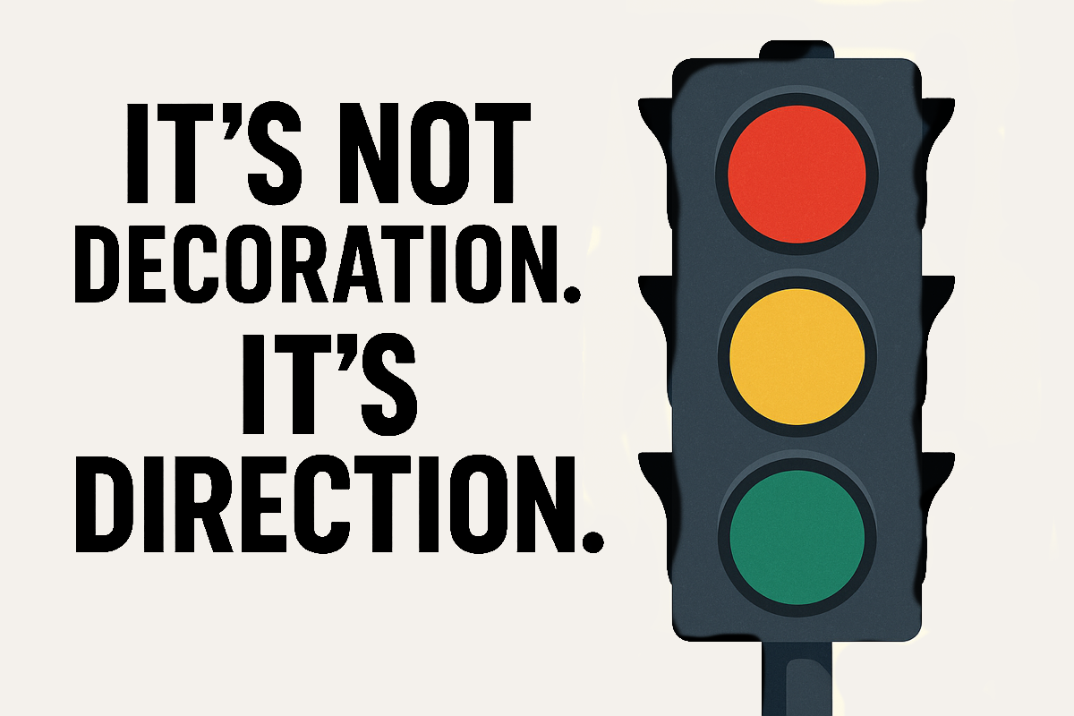
We don’t need louder colors—we need smarter ones. Color sets the tone, builds trust, and drives emotion before a single word is read.

We don’t need louder colors—we need smarter ones. Color sets the tone, builds trust, and drives emotion before a single word is read.
More than ten years ago, Mr. Ali-Cane Hung arrived in Tulum with a vision that would eventually reshape the city’s café and gelato culture. His idea was bold but simple: create a place that combined the craft of Italian gelato and European pastry traditions with the spirit and rhythm
A quiet note on trust, design, and the small signals we build into interfaces. UX doesn’t just shape what users do—it shapes what they believe. And when the interface suggests more safety than it delivers, that’s where the ethics begin.
Sam Altman warned that AI chats aren’t private—they can be stored, subpoenaed, and used as evidence. This exposes a deep UX problem: interfaces that feel safe but aren’t. Here’s what it means for trust, ethics, and communication design.
Cybersecurity isn’t just for IT teams—it’s personal. A LinkedIn article reminded me why awareness starts at home and how EduRisk helps make security human, not just technical.