When Words Become Images: The Cognitive Power of Typography and Visual Design.
Science meets design: how visual hierarchy, typography, and imagery orchestrate attention and meaning.

A deep dive—grounded in cognitive science and design practice—on how images and typography work together to create powerful, memorable communication.
This isn’t theory for theory’s sake. It’s a lens for designers who want to create visual work that resonates, earns trust, and leaves an imprint.
🧠 1. Cognitive Foundations: Dual Coding & Visual Word Recognition
Dual-Coding Theory explains how our brains process verbal and visual input in parallel, activating two memory systems at once. Pairing images with words multiplies recall and depth of understanding.
Visual Word Form Area (VWFA) —a region in the brain’s left fusiform gyrus—processes written words much like images. Typography is more than text; it’s visual form carrying meaning.
Picture superiority effect: images are remembered better than words.
Word superiority effect: letters are recognized faster within words than in isolation.
Together, images + well-considered typography create designs that stick in memory.
2. Typography as Visual Form
Typography communicates before the words are read. Every choice—typeface, weight, rhythm—acts as a signal.
-
Shape & weight: bold sans-serif feels strong; delicate serif feels refined.
-
Word shape (“bouma”): the brain recognizes words by silhouette, not letter by letter.
-
Rhythm & spacing: contrast and grouping guide where the eye lands next.
3. Orchestrating Image + Typography
Great design is choreographed. A visual hook grabs attention, type hierarchy shifts viewers from scanning to reading, and supporting imagery deepens the message.
-
A bold headline or image stops the scroll.
-
Typographic hierarchy moves attention from visual to verbal.
-
Supporting images add context and emotion.
Semantic typography goes further—where the letters themselves reflect meaning (e.g., “Ice” styled with frost).
4. Real-World Design in Action
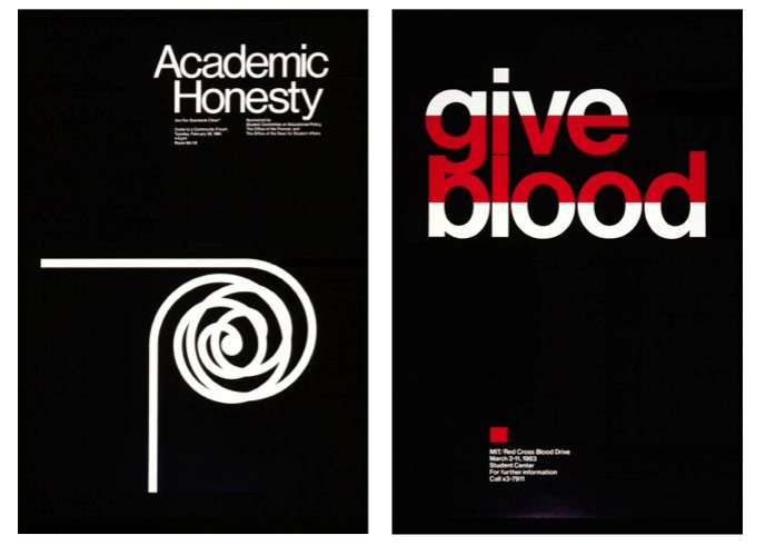
Jacqueline Casey at MIT used minimal, striking posters that merged image and bold typography to convey complex ideas instantly.
WWF Campaigns paired photographic realism with crisp type to build urgency and trust.
Purva Tendulkar’s TReAT replaced letters with thematic visuals—making type playful yet legible.
5. Why It Works
-
Dual coding boosts memory and comprehension.
-
Typography is read as visual form, not just language.
-
The brain encodes words + images together in the VWFA.
-
Hierarchy guides attention naturally and predictably.
-
Picture superiority ensures visuals anchor meaning.
Professional Takeaway
Designers don’t just pick fonts or photos—we build visual language. Typography is a code. Paired with imagery, it creates layered, immediate, and lasting communication.