The hard reality? People won’t stop to figure out your pretty, pretty design. They’re busy, distracted, and looking for the fastest way to get what they need.
People don’t want to “explore” your interface. They want answers. Fast. If your design adds friction, it’s not premium — it’s broken.

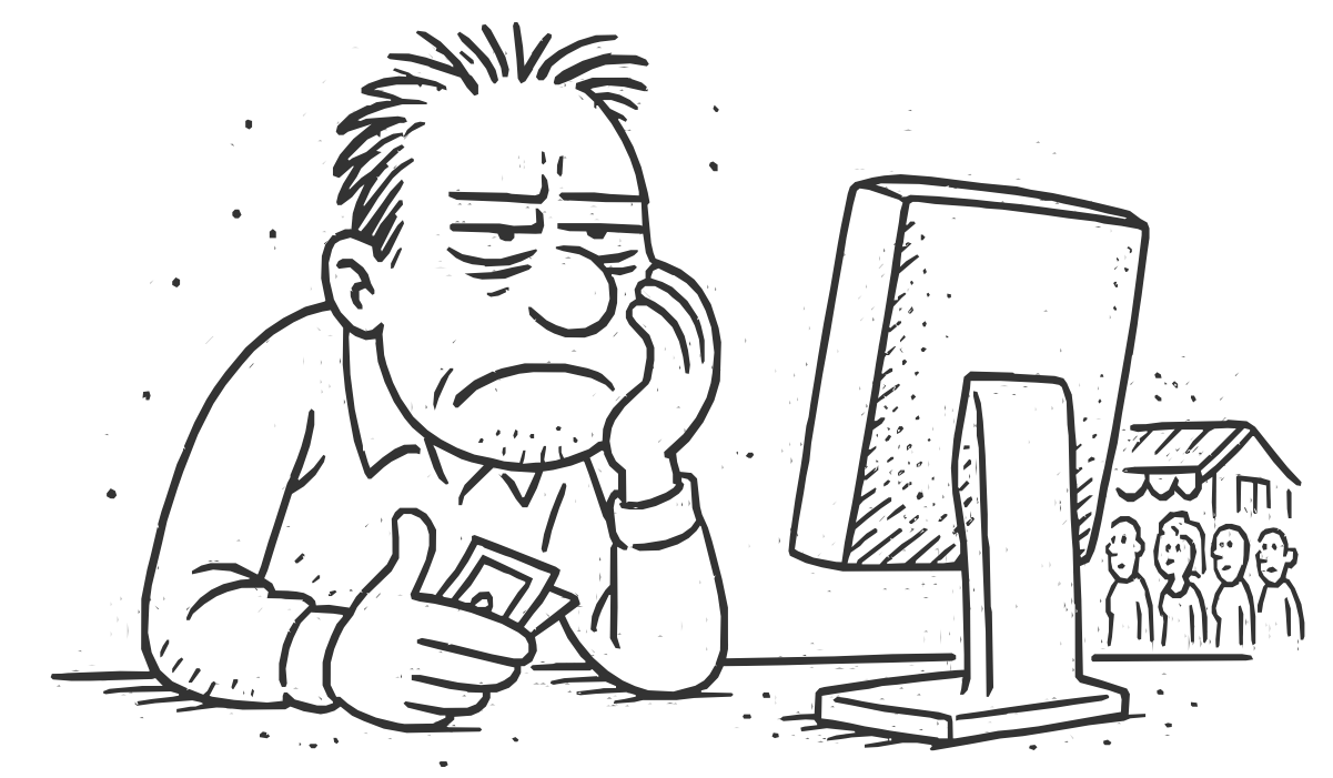
“A confusing website doesn’t just lose attention—it loses trust, time, and money.
If It’s Hard to Use, It’s Not Premium — It’s Broken
The hard reality? People won’t stop to figure out your pretty, pretty design.
They’re busy, distracted, and just want to get things done.
If they can’t find it fast, they won’t dig deeper — they’ll bounce.

“When the design works, users don’t just stay—they light up. That’s the power of clarity.